Knowledge Network: Designing Clarity for an AI-Driven Research Tool
Role: Product & UX Designer
Skills: Information design, AI interaction modeling, systems thinking, cross-functional collaboration, UX research, concept modeling
Timeline: Early-stage product design & later redesign reflections
Project Summary
We set out to design an AI-powered research system that could read large volumes of text, detect meaningful relationships (support, contradiction, cause/effect, analogy), and visualize how ideas connect across sources.
My role was to turn this evolving linguistic engine into an experience researchers could understand, navigate, and trust.
This case study walks through:
what the original system looked like
why it was difficult to use
what early design attempts revealed
how I reframed the problem
what I would do differently today
Background
Researchers face fragmented information: thousands of papers, datasets, articles, and no unified way to see how ideas relate.
Our founder imagined an AI system that could map those relationships automatically — revealing conceptual structure across texts.
The tool could extract meaningful relationships. The question was:
How do we design an interface that reveals insight instead of exposing raw algorithmic structure?
The Original System: What I Inherited
1. Input Experience — A Steep Learning Curve
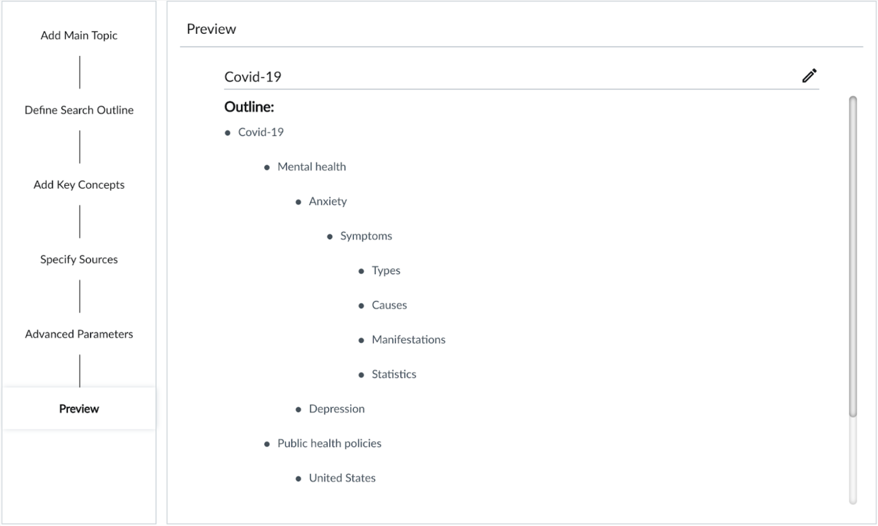
The system required a multi-step query:
topic
subtopics
expansion terms
source selection
advanced filters
In usability sessions, nearly every participant typed a simple keyword into the first field and pressed Enter.
Insight:
Users expected search → results.
The system required instructions → configuration → parameters → results.
2. Output Experience — Dense, Abstract, and Hard to Interpret

Problems visible in this graphic:
too many nodes
overlapping labels
truncated text
edges labeled with abstract cognitive relationship types
no interactivity
Users couldn’t tell what anything meant — only that it was complicated.
Insight:
Graphical complexity ≠ conceptual clarity.
3. A Disconnect Between AI Logic and Human Meaning
[VISUAL 4: Original Relationship Taxonomy Diagram]
The system detected linguistically accurate relationship types (causal, supportive, contradictory, etc.).
But showing those labels directly to users overloaded them with abstraction.
Insight:
Users don’t need technical classifications; they need why this matters.
Understanding the System (Design Lens)
Behind the scenes, the engine detected relationships that were cognitively meaningful:
support
contradiction
cause/effect
analogy
attribution
[VISUAL 5: Diagram of Relationship Types]
This was powerful — but visualizing those relationships literally in a graph was overwhelming.
The design challenge became:
How do we translate machine logic into something people can understand and act on?
Early Attempts & What They Taught Me
Attempt 1: The Relationship Guide

Goal: clarify what each relationship type meant.
Outcome: users still had to remember abstract definitions.
Lesson:
Clear definitions do not equal clear understanding.
Attempt 2: Relationship Filters

Goal: reduce visual clutter by toggling relationship types on/off.
Outcome: fewer lines → but no improvement in comprehension.
Lesson:
Managing information ≠ communicating value.
Attempt 3: Concept Summary Boxes

Goal: make nodes readable by showing brief summaries.
Outcome: helped in isolation, but didn’t scale and made the layout fragmented.
Lesson:
Micro-clarity cannot compensate for macro-level abstraction.
Emerging Success: Showing the Sources

This feature grounded the system in something recognizable and credible.
Users reacted positively because:
they understood where information came from
it bridged abstraction with familiarity
it built trust in the AI model’s reasoning
Design Insight:
Anchoring abstract analysis in tangible sources builds trust.
Reflection: What I Would Do Differently Today
This project took place under typical early-stage constraints: evolving models, limited engineering resources, and pressure to deliver quickly.
My approach was thoughtful but not yet guided by a strong north-star vision. Today, I would:
define that vision up front
design interim steps that ladder toward it
reveal AI reasoning progressively, not literally
guide users through meaning, not mechanics
anchor abstractions in human-friendly explanations
use visual storytelling instead of raw graphs
Your existing visuals actually support this evolution beautifully — your diagrams show where the system succeeded and where it overwhelmed users.
Design Principles That Emerged
These now guide my work in AI UX:
Clarity is not simplification — it’s what makes complexity usable.
Surface meaning, not machine structure.
Ground abstraction in familiar artifacts (sources, excerpts).
Provide guided exploration, not raw output.
Translate reasoning steps into intuitive user flows.
Next Phase — Designing for Meaning
I’m currently working on a redesigned version that:
starts with user questions
presents insights as guided paths
surfaces system reasoning step-by-step
makes the graph feel like a narrative, not a map
This reflects the lesson that understanding emerges from context, not structure alone.
Final Summary
This case study shows how I design for complex AI systems:
turning internal linguistic logic into human meaning
transforming overwhelming structures into guided journeys
using UX to clarify, not simplify
building trust through transparency
designing under constraints with long-term structure in mind
combining systems thinking with human-centered interpretation